5. Silver Gelatin P.O.P. Collaborative Research Project — Color and Curves |
The main reason I love POP is the colors that are possible. It's hard to duplicate them with standard silver gelatin paper and secondary toners. A second excellent reason is the density range. To the best of my knowledge and experience, only bromide paper is a close match. There are reasons one might choose to avoid the process. First, it uses more silver than developing-out paper. Second, unless you live somewhere with reliable sun most of the year, a UV light source is required for exposure.
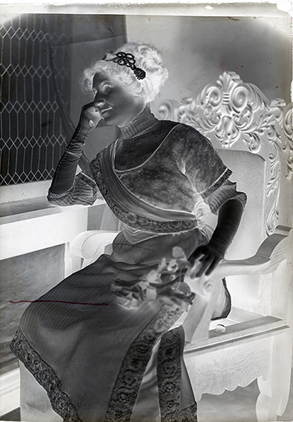
Below: A century plus-old 5x7-inch dry plate and its digital positive (retouched) from the scanned plate. The shadows and highlights are leveled for maximum detail. A properly exposed and developed negative has a wealth of information. The goal of any printing process is to not lose any of that information. |
|
|
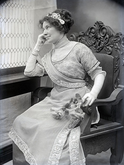
Below: Two ClBr prints ("3-Salts"). The basic colors possible in developing-out paper (without using a secondary toner) are pretty much limited to various shades of black to brown. |
|
|
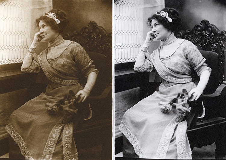
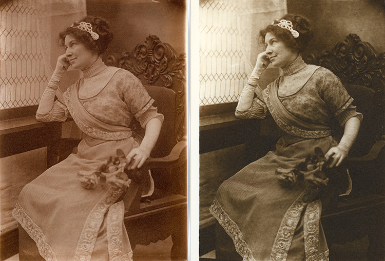
Below: A comparison of a toned POP (left) and a ClBr print developed for a warm tone. The longer density range of the POP print is evident. One of my goals for this project is to compare several different POP emulsion recipes and learn their individual characteristic curves, along with how to control the contrast of an individual print. Denise Ross |
|
|
|
| < Reading #1 Recipe #1 - p.1 > |