| The book is out! |
|
December 10, 2018 |
|
|
Home again, home again, hippity-hop!
|
|
October 29, 2018 |
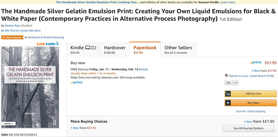
Hi Everyone! I've finally had time to remodel The Light Farm. Anyone familiar with this site knows that it's been pretty quiet for the last several months. I've been deep into writing a book and (never a multi-tasker, I) the website paid the price. But, the book is done and heading to the printer. It's available now to preorder. It will start shipping toward the end of December. The links to Amazon and Routledge are on the home page. In the meantime, and for the far foreseeable future, my Blurb book is free to read in Blurb preview. I wrote the book because I believe that, as convenient and valuable as websites may be, electronic words and pictures are more vulnerable than physical ones. Making the book's information both free and available to purchase seems to me the best of both worlds. There isn't an e-book or pdf version of the book. I have no plans to produce either. The new Focal Press book is a different matter. The book belongs to Routledge Press. In exchange for superlative publishing and printing quality, they handle marketing and sales. I can't publish anywhere else the exact information that's in the book. Focal's production quality and distribution network, along with a far lower price per page than Blurb, make any constraints a very fair tradeoff. The book is primarily about printing paper and paper negatives. I plan on continuing my blogging about film and dry plate negative emulsions and their potential. There is still a lot I want to understand about making and using panchromatic materials. After that, I'll be expanding the Silvergum section. Next summer, I hope to get a chance to play with handmade movies. Right now, the home page seems naked! That's primarily because the information has been consolidated and organized to the best of my ability. I look forward to filling up the page again! As always, I invite any photographers working with handmade emulsions to contribute to The Light Farm website. If you write a book, I will be delighted to promote it here. The same is true for any shows you are in. Please email me at editor@thelightfarm.com. The very best of fun and creativity to you. In a crazy and too-often tragic world, art is more than a comfort and refuge. It is a necessity. An aside: There are still a handful of broken links, picked up in the "remodel." I'm chasing them down and fixing them one by one. |
|
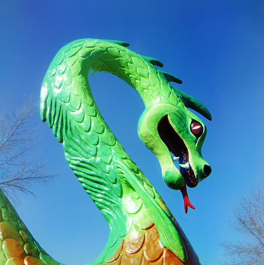
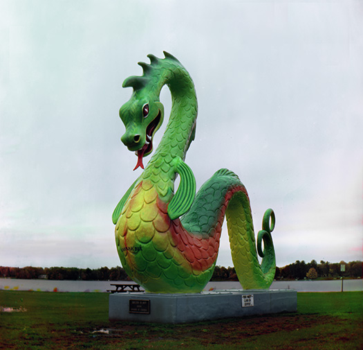
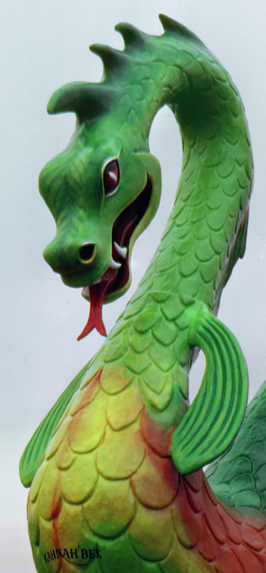
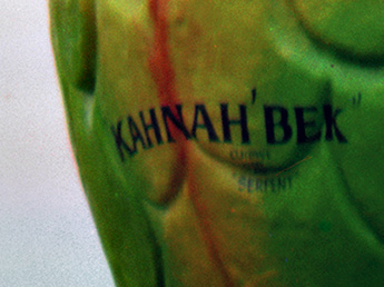
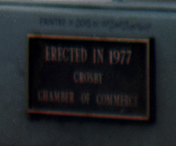
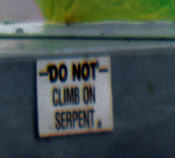
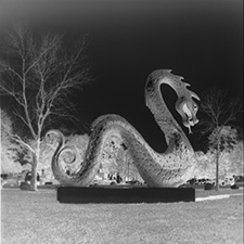
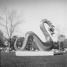
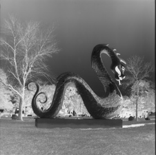
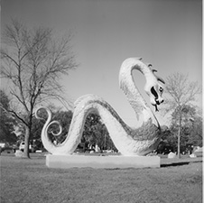
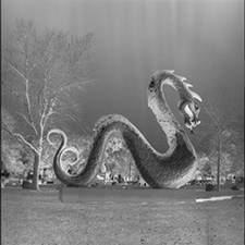
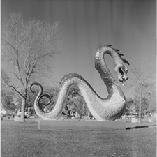
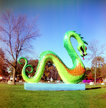
Finally — The Crosby Serpent in Living Color (!) |
|
October 14, 2016 |
I'm back from another trip to Minnesota. There was even less time than usual for photography, but the time I did get was perfect. I came home pretty much sure of my personal photographic goals for the foreseeable future. What more can you ask for. I've enjoyed every step of the last ten years researching and back-engineering emulsions, but it's been more about the great satisfaction of science rather than pure, in-the-bone joy of photography for photography's sake. I would never try to understand why some things just click, but nevertheless, it seems to be a universal truth — different folks, different strokes. I'm a vernacular photographer at heart and I'm in love with tri-color assemblage and I've found the perfect camera for both. 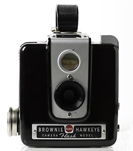
|
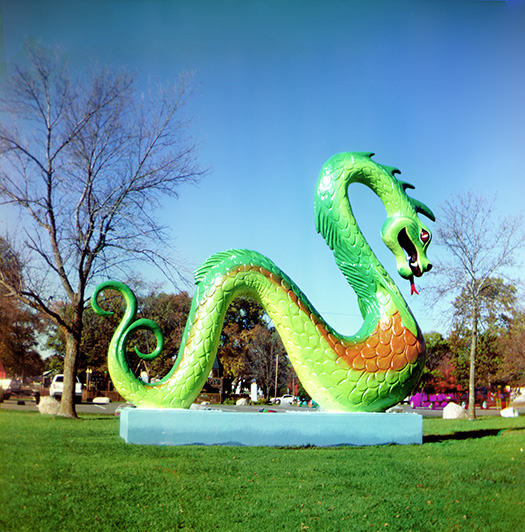
The Brownie Hawkeye is a 620 film, 6x6 cm format camera with a glass meniscus lens and one f/stop (f/16). It has one shutter speed and Bulb. For tri-color assemblage, only the Bulb setting is important. Exposures range from many seconds to many minutes. It's compact and lightweight. The lens is surprisingly good. It's only a little soft. Actually, it's not so much soft as gentle. It fits the process. All images, no matter the process or camera, end up with a certain sameness by the time they are converted to web-appropriate jpegs and viewed on a screen, but in .tif or printed on paper, the Hawkeye images are easy to pick out from an ultra-sharp Fuji rangefinder (Lady Pirate) or a Rolleiflex TLR (the Nessie photos). Beyond the perfect (to me) match of lens quality and process, the Hawkeye has an important thing going for it — it is still readily available on ebay and it's still cheap. This is important for reasons besides budget. Tri-color assemblage has a tremendous appetite for film. If you only bracket two exposures for each of three filter colors, you've used half a roll of 6x6 format film. Handmade film can't be loaded in the light like commercial film. The factory-rolled or crimped edges are gone and light can leak in ("pipe") from the edges of the roll. If you are traveling and you want to photograph a number of scenes, you need a number of cameras along, pre-loaded with film. The Hawkeyes are so compact and light many of them can fit in a reasonably-sized camera bag. |
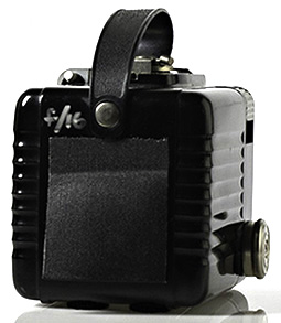
As with all old cameras with a red window to see the advancing film, it's best to make a black tape flap to prevent strong light from entering the camera. More expensive cameras had a "window shade" that you kept closed between exposures, but the Brownie Hawkeyes were never expensive cameras. The cameras are fairly easy to clean up. Besides lens cleaner, I like Hagerty 100 metal polish and Renaissance Museum Wax. I wrote f/16 on the body so that I wouldn't forget. I play with too many different cameras! |
The crop immediately above is color fringing from Canada geese moving along the lake shore. |
No camera is perfect. How could G.A.S. survive otherwise? It's always baffled me that cameras with a Bulb setting wouldn't, by necessity, have a tripod socket. But, alas, it's often the case. The Brownie Hawkeye is among them. Fortunately, this isn't hard to overcome. Annoying, maybe, but not difficult. |
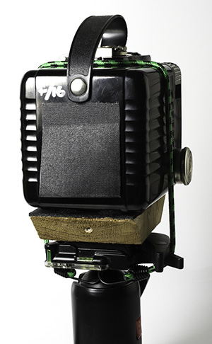
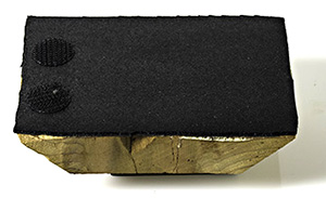
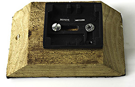
I fished a likely piece of wood out of the kindling basket and glued non-skid shelving liner to the top. On the bottom, I screwed down a quick release plate for my tripod ball head. I also attached a couple of Velcro dots matching the placement of their mates on the bottom of the Hawkeye. Sitting atop the tripod platform and held down with a small bungee cord, the camera is as secure and stable as if it were glued there. If the platform is left on the tripod, setting up the camera doesn't take any more time than if the camera itself had the quick release plate. 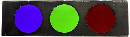
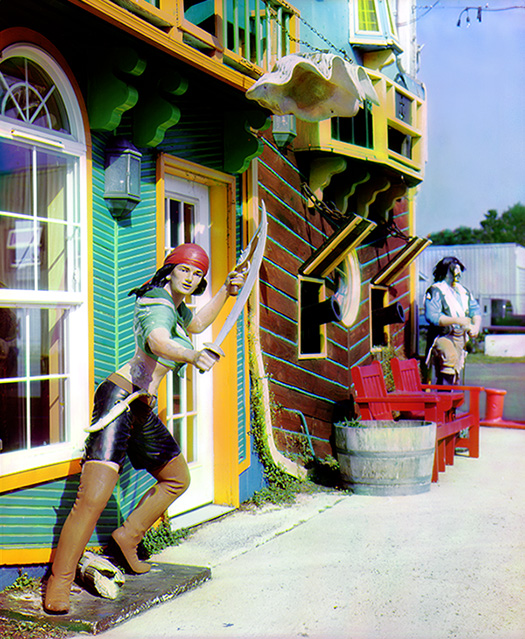
Another less-than-ideal aspect of the Hawkeye is the almost non-existent rim around the lens. There isn't anywhere to attach a filter holder. The filters must be held in front of the lens for the time of an exposure. The third Serpent photo was on a very dark day. It was spitting snow. The red exposure was many minutes long. Before I go out again, I'm going to figure out a way to attach the filter to the camera so that my hands can be in my pockets! For the Lady Pirate and Nessie photos I used Lee polyester filters in a filter holder attached to the camera lens. With the Hawkeye (at least this time) I used a tri-color stack from, I think, a Curtis camera. The filters are glass set in a metal frame. It worked well for traveling, and is impervious to weather, but it has a slightly different set of filter factors than the Lee filters. Take home message: know your tools and materials. It helps to work with one system — film, camera + lens, and filters — until you know them inside and out. |
'AmBr-Pan' negatives and the tri-color process This is still very much a work in progress for me. As with most things really fun and worth doing, the basics are easy. Mastery is a commitment — or at least it starts with commitment. That's where I'm at now. Nothing would make me happier than for someone else to jump in and brilliantly work out all the details and then share them with the rest of us! My Hawkeyes and I just want to go walkabout and see the world. Until that time, I'm happy to share what I've learned so far, but remember — work in progress. |
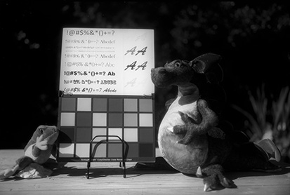
There are three negatives — blue, green, and red. To really understand how this works, open the Channels window in Photoshop for any color image (make sure you've unselected "Show Channels in Color" : Edit>Preferences>Interface). Move back and forth among them for both the positive and its inversion (negative). That exercise is worth more than a thousand words from me. To the left, from top to bottom are B, G, and R negatives and their positives. The positives are loaded into a stack in Photoshop Scripts. A link to the exact workflow is in the previous entry here. If the negatives are well-balanced, the assemblage color is very close. The color image on the left, at the bottom of today's entry, is the straight script, ending with "auto color." |
The final image to its right was corrected almost entirely in Photoshop "Selective Color" in the "whites", neutrals", and "blacks" channels, playing with the various color sliders until white was white and black was black. I kept the filter factors as simple as I could and it seems to work. +2 and +3 for blue, +3 and +4 for green, and +5 and +6 for red. In a pinch, just +3 for both blue and green would probably work, but bracketing red is smart insurance. I don't know how much of the high filter factor for red is in the inherent sensitivity of the emulsion and how much is reciprocity failure compensation, and it doesn't really matter. It's an easy sequence to remember, and "easy" is often a very good thing! |
|
One more thing to note (and it's a weird note): look carefully at the red negative. It has density streaks. All the red negatives have this. Only the red negatives. I have some theories, but more on that later. They don't have a lot of impact on the final image and what little there is, is easily fixed. For now, I'm fine with it. That might change. I'm prone to mission creep/perfectionism — something I'm trying to conquer. Roll-your-own color photography in an old Brownie camera seems like excellent therapy ☺. |

|
| 'AmBrChrome' at Aquarium Village — Tri-Color Assemblage |
|
September 17, 2016 |
This could go OCD — the perfect storm — compulsively fun and 'AmBr' emulsion is so easy to make there's no worry about burning through materials! The challenge is in the use of the materials rather than making them, and I'm definitely ready for that. It's a plain silver formulation (i.e., no ammonia) so the parts can be made up in short stages spread out over several days, if need be. Panchromatizing the film is easy and it's already on the website here, here, here, and here. The basic recipe is in the website tutorial section and in The Light Farm book. I really hope someone else gives this a try. I don't think I have much more to offer except the occassional tip. As I've noted before, success is about negative balance. Some things can be adjusted in Photoshop, but basic negative quality is important. Not too thick. Not too thin. Beyond that, there is a lot of room for creative control. If you accept that color balancing can be done in Photoshop rather than in the filter tray of an enlarger, all is good. Great, actually. Color balancing is where electronic manipulation has physical manipulation beat hands down (that, and spotting!). Removing the artifacts of color fringing from movement is easier than I had expected, although I'm still working out the best and easiest way for that and everything else — probably will be for a while, especially with winter closing in fast. I'm getting a sense of what kinds of negatives work best for what I'm aiming for. I like them as dense as possible before information starts getting lost to halation. A thin negative set makes an image more like a transparency, but that isn't always good. The filters have slightly different filter factors for 'AmBr-Pan' than what is recommended as a starting place for commercial film. The green filter nails the recommendation at +3, but the blue filter is only +1 or +2 (rather than +2.5 or +3) and the red is +4 or more (rather than +3) depending on the time of day. That is actually a real boon for working with the film. 'AmBr' is very slow to start with (ISO 3-12, depending on time of year), so it works just fine to use a very dim red LED headlamp in the darkroom with the film. No night vision goggles and no stumbling around in the absolute dark. |
Above: A thin, contrasty negative set. The red cast in the lower left corner is from accidental vignetting from my careless placement of a filter. It could be removed by dodging the negative in that corner. Left: A dense negative set. It was a windy day and there was color fringing in the clouds. I was able to remove it in Lightroom with the color sliders. |
|
|
| Pete Poses for Paper, Pinhole, & Holga |
|
September 10, 2016 |
I recently bought a new lens for my Pentax K3. Sharp as a tack, as the saying goes, and I love it. Digital should be sharp (personal opinion alert), but is it even necessary to say that a new digital lens is sharp? Lens designers have to go out of their way to make a lens today that isn't sharp. As far as I'm concerned, that just doubles down on the upsides of digital photography. "Sharp" is done. "Easy," "foolproof," "perfect" — all done. Everyone knows that digital has liberated mere mortals from having to learn anything to make a great photo. What is often overlooked is that it has also liberated us from all the artificial technical criteria and expectations that were such a plague in the Golden Age of chemical photography. I was one of the multitudes of photographers who chased each and every one of those criteria. I'm (mostly) glad I have a perfectionist gene, but with every day that goes by I appreciate more and more the serendipity of "imperfection." It would seem I'm in great company. Even with Holga gone, lo-fi photography is booming. Pinhole has never been more popular and I think paper negatives aren't too far behind. I've never been more delighted to be one of a crowd. It would bend my basic nature too far at this stage in my life to go wildly artist with the possibilities —I happily leave that to other (probably younger!) souls — but I'm greatly enjoying playing with the materials and even more, enjoying the photography of others. The prints just on Facebook are amazing. One Golden Age aspect I'd give anything to see return is the galleries devoted to photography. The prints seem now mostly on electronic devices should be seen up close and in person. Left: 4"x 5" paper negatives ('TLF Paper Negative Emulsion') This recipe and the best-practices for working with it will be in Volume 2 of the Light Farm book series. Since that's not scheduled until a year from now, I'm sure that before then it will end up in some form or another on the website. |
|
|
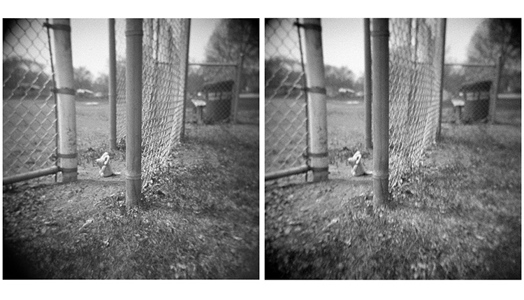
'X2Ag' in a Holga Stereo 120 film camera |
|
|
Far left: Paper negative, crop |
|
|
Pete with a 4"x 5" Travelwide pinhole camera and 'X2Ag' film. A convenient coincidence is that 'X2Ag' in the pinhole camera has the same exposure as 'TLF Paper Negative' in a conventional 4"x 5" with the lens set at f/8. p.s. The sky really did look like that, but with color! I've never scrambled down a bank and set up a camera as fast as I did that day (patting herself on the back :-).
A crop of Pete's pinhole portrait |
|
|
And. |
| Color Photography for the Time Traveler |
|
August 29, 2016 |
The question which has been hanging out in the air around my head is what fun thing to do with panchromatic film, if not Autochrome. There are certainly situations when pan film is useful — photographing fire trucks comes to mind — but that's not "fun," that's utilitarian. Of course, the fallback answer is traditional color separation negatives for the various three-color printing processes. This would be for the consummate DIY'er who eschews digital separation negatives. That's not me. I love digital separation negatives. So, the time machine gets set back to late-tsarist period Russia and Sergey Prokudin-Gorsky. If you're not familiar with his work, do the Google thing. Marvelous stuff. It's a puzzle why I haven't thought of this before. In a way, it's a natural. Back in the early 1980's while I was at Arizona State University taking Russian language classes in addition to photography, Bill Jay tried his best to get me to research P-G for my MFA. I adored Bill (as did everyone who knew him), but I had pretty much decided by that time to drop photography and give botany my all, so I declined. I've never regretted that decision, but it is with bemused joy that I realize I seem to have come full circle. |
You might recognize the image to the (lower) left. It is from the three-color separation set I posted on August 22. It has been turned into a color photograph by the same digital procedure that historians used to recreate Prokudin-Gorsky's photographs. It didn't take me three minutes to figure out that excellent quality separation negatives with the right density balance among them is essential to accurate color reproduction. The set from August 22 were all overexposed, particularly the white card. Halation blasted a great deal of the fine detail and one negative was so blasted that the lettering on the card was obliterated. That is the reason the lettering is green, rather than black — an entire color layer is missing. It's the same reason that "light skin," orange, and orange yellow are wrong, and the red "A" on the white card is orange. No amount of Photoshop fussing can put in colors that aren't there. On the other hand, the image at the top of the page is almost perfectly balanced, having needed just a bit of PS color density and balance adjustments. I exposed an entire roll of panchromatic film ('AmBr-Pan') and bracketed each of the three filter colors. Then, I put together different combinations until I got the best balance. Now, the only trick is to practice enough, in enough different lighting situations, to really understand the filters and how they see the light in each. I don't want to commit an entire roll of film to one scene on a regular basis! I already know that a bright, sunny day is different from a cloudy day. Shade is different from both. One caveat to this process: a perfectly still scene is vital. On the top image, the card was moving ever so slightly in the breeze. Color fringing is the inevitable consequence. I owe an enormous debt of gratitude to Scott Bilotta and his website, Scott's Photographica Collection. I would have never figured out color separation assemblage without his excellent tutorial. http://www.vintagephoto.tv/photoshop_assembly.shtml And one more interesting link: here and the following page here. Turning the Prokudin-Gorsky collection into the glorious images we recognize today took an enormous amount of time and dedication. Deepest gratitude to all the art historians who help us time travel. |
|
|
| Negatives — Paper and Otherwise |
|
August 25, 2016 |
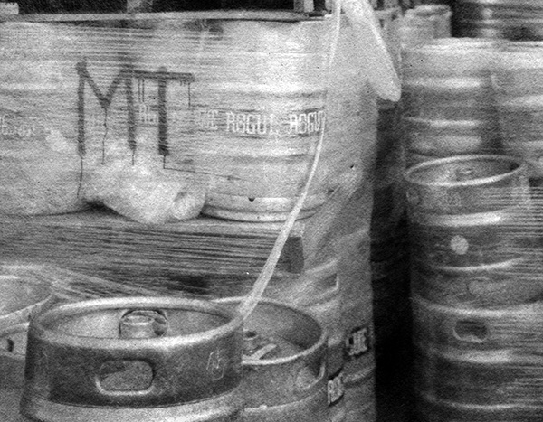
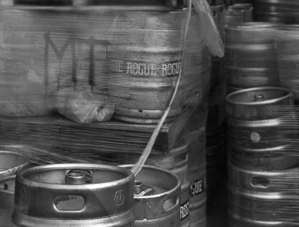
A couple more tests of paper negatives vs film. I happened to catch barrels of beer outside at Rogue Ales in Newport last week. Both the top paper negative and the film negative ('TLF#2') below it are Whole Plate format. I don't usually cut film that big. I don't get enough sheets from a batch of film to do a lot of rigorous comparison testing — essential to writing a book you want people to trust! This, however, was an excellent excuse to use a big sheet of 'TLF#2'. I think it's probably my favorite emulsion, certainly for shiny surfaces. It's "glowy" by nature and I love finding the right subjects for it. Paper negatives, on the other hand, are so fast, cheap, and easy to make, that they are perfect for large formats. |
|
|
Below: Mouse at Literacy Park. The top set is 4x5 'AmBr' film. The bottom set is a 4x5 paper negative. The pink color is from the erythrosin used to make the negative orthochromatic. It doesn't wash out of paper like it does film. The paper negative takes at least a stop more exposure even though the emulsions are essentially the same. There isn't any light bounce off the back of the film to augment the exposure. Also, a paper negative (at least this variety) is much lower in contrast. This can be a very good thing. The sun was bright and harsh on the bronze sculpture when I exposed this set — difficult conditions for the naturally contrasty 'AmBr'. I should have given the film negative a N-1, or even N-2 treatment, but for comparison's sake, they both got standard exposure and development in HC110. The paper negative almost post-processed itself. A simple scan, invert, and auto-contrast. The film negative took a bit of fussing with curves and levels. 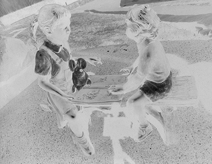
|
|
| Paper Negatives and Panchromatic Film |
|
August 22, 2016 |
August 22?! I do not know where the summer has gone. It doesn't help that we haven't had much "summer" yet. When the Willamette Valley to the east of us heats up, it draws the fog in. I feel like I've spent half the summer sitting in a fog bank. But when the days are beautiful here, every rainy and foggy day is forgotten — just need to remember to do some outdoor photography when the outdoors isn't hazardous to old cameras! I'm prioritizing the remaining summer good weather window for testing paper negatives and panchromatic film. Paper Negatives Paper negatives have increased in popularity more than I would have expected while excellent quality commercial films are still available. Price maybe? RC paper is about a quarter the cost of sheet film. Easier to work with? Paper can be handled in safelight conditions. I think it's a bit of both, but perhaps mostly it's about the fun and "looseness" of the process. I know that's what's grabbed me. For anyone interested in D.I.Y. photography, but intimidated by the process of just getting started, paper negatives are an excellent way to get started. You could coat on commercial (glossy) baryta paper and end up with a product identical to commercial paper, but I'll leave that alone for now. As long as excellent quality commercial products are still available (and long may it be so!), I see no reason to re-create those products. Handmade photography is its own art form. The basic paper negative for "TLF, Vol.2, Beyond Basics" has its own identity. After testing a number of likely candidates, I've settled on my favorite paper. The basic emulsion recipe is a variation on 'AmBr'. I'm working through the exact tweaks that make the emulsion best suited for paper. More soon. |
|
Below left:4x5 'AmBr-O' film. Below right:4x5 paper negative. Wanderlust camera, S-K Angulon 90mm 6.8 lens. |
|
|
|
|
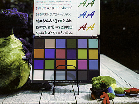
Panchromatic Film The familiar ColorChecker chart in digicolor and three 'AmBr-Pan' negatives exposed with tri-color separation filters. If you are familiar with the RGB channels in Photoshop, these negatives (inverted and auto-leveled by the scanner software) look very familiar. There is potential beyond Autochromes for panchromatic film, and I'm very happily exploring those now. More soon. 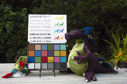
|
|
|
|
| Mouse Goes to Minnesota |
|
August 12, 2016 (and he took a Fuji 645 rangefinder and Holga stereo camera (with lots of 'X2Ag'.) |
|
|
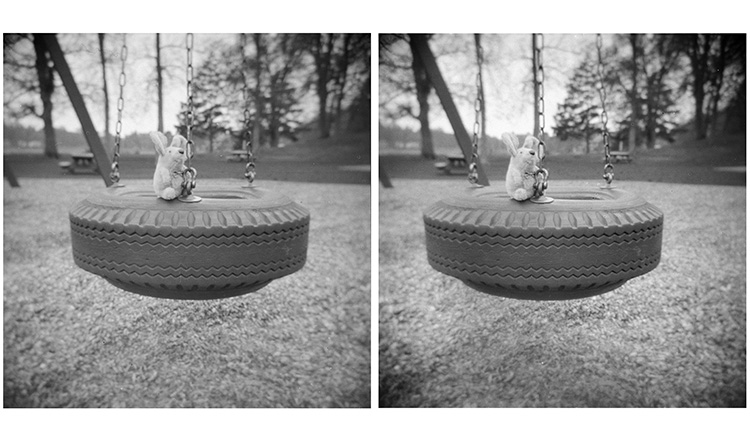
I go to Minnesota to visit my mom. There isn't much time for photography, and I want to travel light — all the better to practice "carry on" photography. I take a different camera each time I go. Once, I carried a Baby Speed Graphic and mailed film in holders ahead of my trip and then mailed it back home when I left. That works when you are confident of the address. Better, I think, is just taking what you need in your carry-on luggage. I don't ask for a hand inspection and I've never noticed the least fog from security screening. A Fuji rangefinder looks enough like a "normal" camera that it doesn't give TSA folks the twitterpates. I was asked about the Holga. I simply said, "a toy camera." That did the trick. Maybe it helped to travel with a little plush mouse! I packaged my handmade film in Kodak 120 TriX boxes and they passed without comment. A number of years ago in Duluth, Minnesota, my Baby Speed Graphic was the cause of much consternation and repeat screenings and finally a hand inspection. Not creating a fuss is a much kinder and gentler way to travel. Travel seems to get more complex and uncomfortable with each passing year, but my experience is that TSA is at least as accepting of film photography as it was fifteen years ago. This is a happy thought. Walking around with the Fuji 645, I looked for as many different kinds of lighting situations as possible. I didn't use a tripod, so sometimes the aperture was on the shallow side — a factor in the composition. The Holga stereo really can't be handheld, so it went on a little Joby Gorillapod. I love the Gorillapod. It can be set on a flat surface or wrapped around something convenient — |
|
|
|
|
|
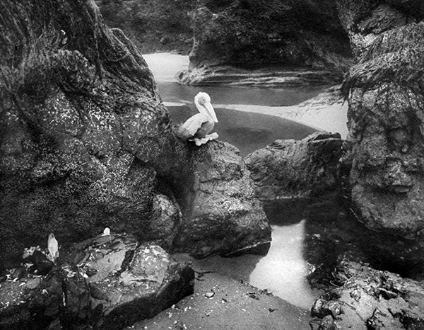
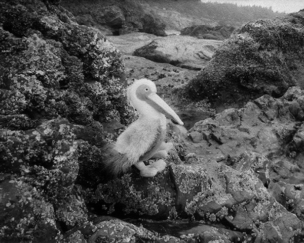
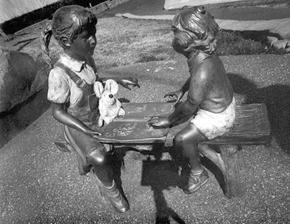
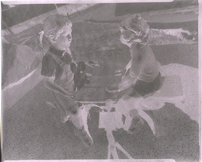
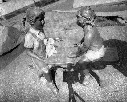
| The Clan of the Velveteen Rabbit |
|
August 11, 2016 |
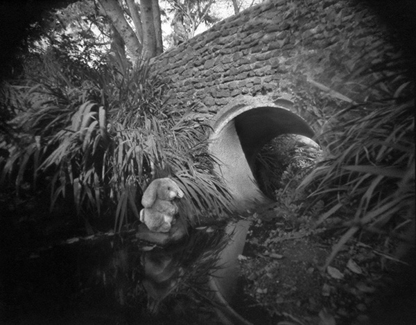
4x5 pinhole camera, |
|
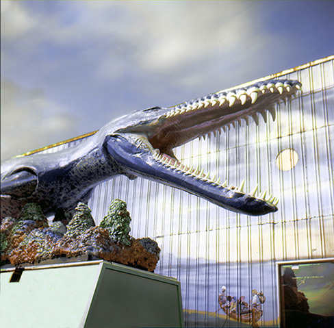
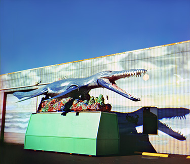
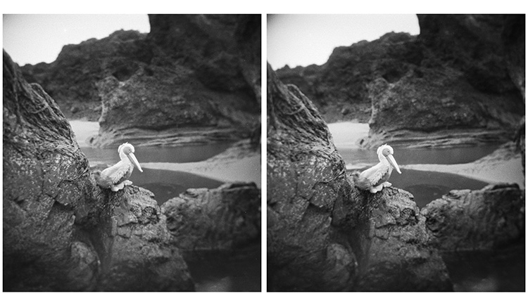
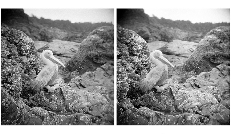
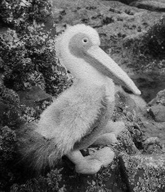
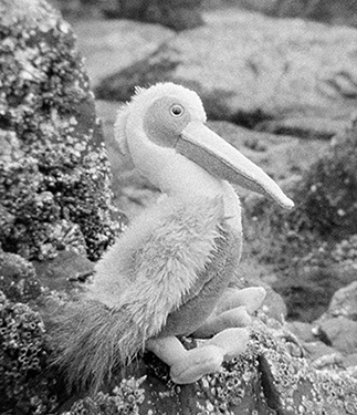
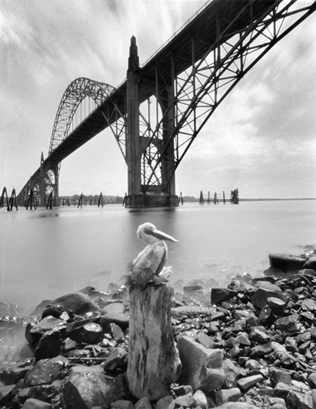
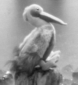
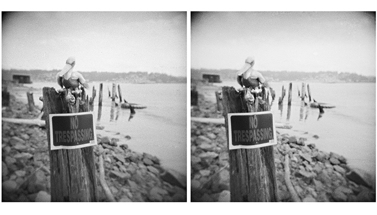
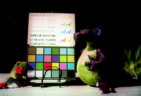
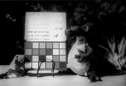
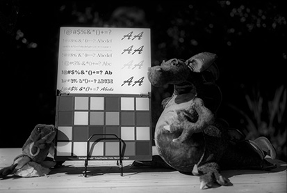
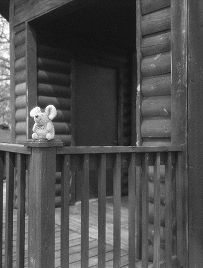
OK. High time to be back here. I've spent months now going forth and back and forth again trying to plot the way forward for TLF. [An aside: I'm painfully aware of how vanishingly unimportant handmade silver gelatin is in the big picture of the world's challenges and problems. I'm embarrassed to admit that had been weighing on me recently. A couple of conversations with other photographers didn't help, but regardless, I'd have thought I was well past that particular stereotypical existential crisis. It seems lessons once learned must periodically be relearned — art (and joy) never need to be justified. Enough said. Moving on...] It took some time to get back to work after my Autochrome misadventure, but I'm again researching and testing recipes and materials for Volume 2 of The Light Farm book series. Long story, short — although it felt right to get back to research, I realized I was seriously bored with testing in my backyard and seriously tired of being serious! The world has enough of that going on without my adding to it. But I felt stuck. I figured what I needed was to minimize my gear. That seems to be current conventional wisdom, right? Space and possessions can't be too minimal? In a thoroughly misguided fit of studio cleaning, I started packing away my collection of stuffed animals (actually the old collections of the children in my life). I swear I heard cries of protest. I stopped, pulled the animals out the boxes and put them back on the bookcase shelf and promised them time out in the wild. I've long since outgrown being inspired by new gear (R.I.P. G.A.S.), but it seems I'm finally old enough to play. |
|
|
| A Diary |
|
February 19, 2017 |
|
The previous blog — A Diary, The meandering adventures of a time-traveling photographer — is here. |