19. Deep Dive, part 3—Panchromatic
"Colorblind". "Ordinary". Orthochromatic". "Ortho". By and large these are terms that have slipped into history. Only film geeks are generally familiar with what they mean. But, "panchromatic"? That's just film—the old, familiar b/w film. Yellow box. Green box. Not much to say.
Except...
Panchromatic is a theoretical ideal. Not only that, it is based on someone's psychological perception of "correct" brightness turned into a mathematical model. This is part of the reason a straight-out-of-the-box roll of modern pan film is a rather flat affair. It is basically a compromise designed to be OK with as many consumers as possible. This is not a criticism. Modern photographic materials are a miracle of precise engineering. But imposed compromises are just begging to be argued with.
To transcend the box, photographers often use contrast filters. If you want the red apples on a green tree to stand out, a green filter will lighten the leaves and darken the apples. Where I live, west of the Cascades in the Pacific Northwest, it can feel like green is the only color. A green filter lightens the greens, but not all greens equally. (Remember that no color in nature is pure.) What would otherwise be an undifferentiated gray smudge can be turned into a symphony of tones. I used to never go out shooting without a yellow-green filter in my pack. I have a personal expectation that green is lighter than it records on most commercial pan films. Putting a filter in front of your lens is usually just fine, but given a choice I'd rather have an emulsion that naturally responds the way I respond to the light values in a scene.
Left: Photographic Emulsion Technique,
by T. Thorne Baker, 1941
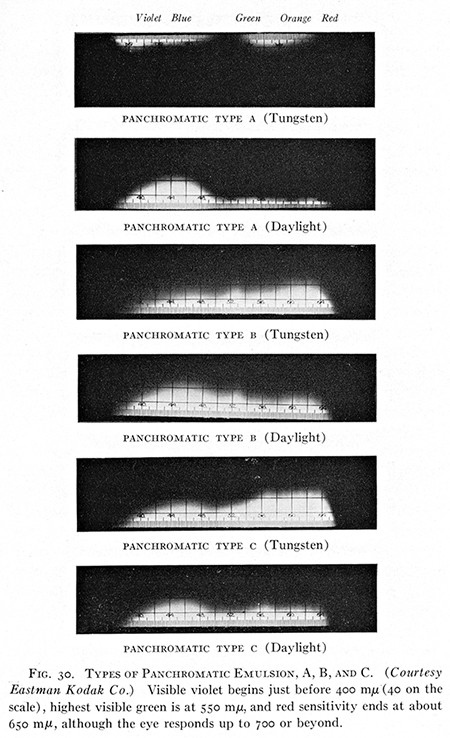
In the heyday of silver gelatin, there was more than one type of panchromatic film. 'Type A' had a low red and high blue sensitivity. It was sometimes called orthopan film. 'Type B' was/is fairly well balanced, but still benefits from a yellow filter, and 'Type C' with high red and low blue sensitivity. Modern T-grain film does one better on Type B by reducing the blue sensitivity in the emulsion. This makes the use of a yellow filter more optional than with most other films.
And here's where our fun really starts. The potential to craft a film to our personal vision and technical requirements is far greater than I expected when I started making emulsions, and I had pretty high expectations!
We each carry a mental list of expectations for our craft along with the things we are willing to do to achieve our goals and the things we are not. I think I might be willing to become a silver miner if need be, but I'd turn to chalk drawings on a cave wall before I'd make my own gelatin. And that cave would be lit by a good torch. I don't like working in complete darkness, but I absolutely don't want to use night vision goggles. I'd have to wear them over eyeglasses. No thanks. I want an emulsion that records greens lighter than the standard convention. My ultimate goal is some version of color photography. A major requirement for that goal is panchromatic film. For that, I thought I'd have to at least bend on the "no complete darkness" thing—and I've seldom been as glad to be wrong.
The trick comes in two parts: 1) being delighted with a Type A pan emulsion, and 2) using a sensitizing bath rather than putting the panchromatic dye in the emulsion before coating.
Pinacyanol chloride seems to be an ideal red sensitizer. It fits my criteria of being safe (enough) to use, (reasonably) inexpensive, and (important)—used for something besides chemical photography, so it is likely to be available into the future. Go to labdepotinc.com for a lot more information. 250 mg will last you a very long time.
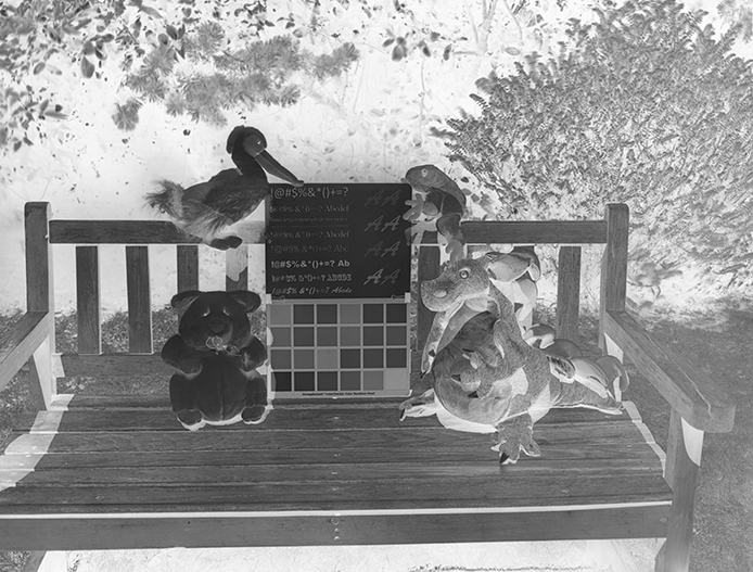
Panchromatic plate,
no filter on the lens
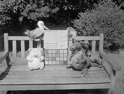
Above left: Panchromatic plate/straight PS invert. Above right: Desaturated digital file.
The plate obviously needs the right printing paper. It's a dense plate—denser than optimal for silver gelatin. The light when I exposed the plate was harsh and direct. The plate would have benefited from D23 and water development more than the D23 and borax it got. As is, it would be a better fit with some of the other printing processes, particularly carbon. Photoshop, of course, could do anything with it.
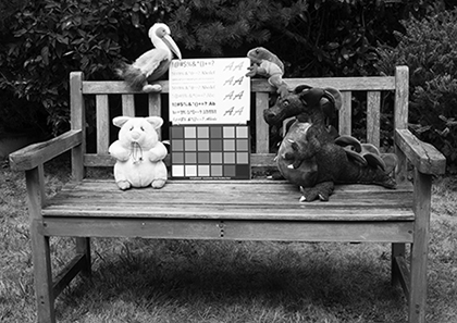
For a true comparison with the digital standard, I cropped out the color charts and applied the Photoshop Levels white point to the white squares and the black point to the black squares. (AmBr crop on the left.)
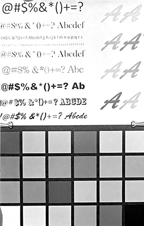
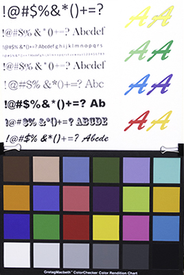
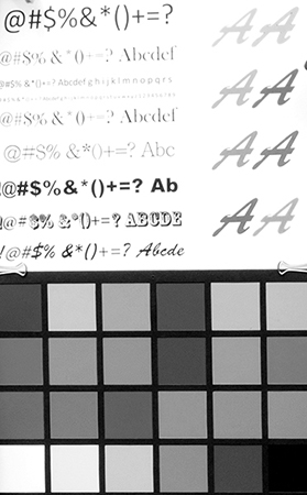
The Type A pan characteristics stand out. The blues are lighter than the digital standard and the red is darker. Also, and by design, the yellows and greens are lighter. This is because I made the emulsion partially self-screening. (It has an incorporated filtering dye.) I added yellow dye with the finals to the emulsion before coating. It turns out the Yellow #5, the standard yellow food dye, is tartrazine, an excellent yellow filter. Details for its use are on the recipe page. Yellow #5 can even be used to make soft-optics filters. For more on that, go here.
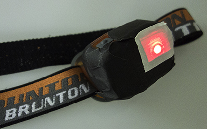
The slow speed of the emulsion together with its incomplete sensitivity to red allows darkroom work in very dim red light. It works out very well, actually. I've been using a red LED headlamp with the casing and all the bulbs except one covered with black tape. That remaining bulb has several layers of white tape over it. It produces just enough light to see your hand when it's in front of your face, but it makes all the difference. It even makes developing by inspection possible if you use a white tray and only direct the headlamp at the negative for a few seconds once a minute.
Continued...